Design Your Course with Accessibility in Mind
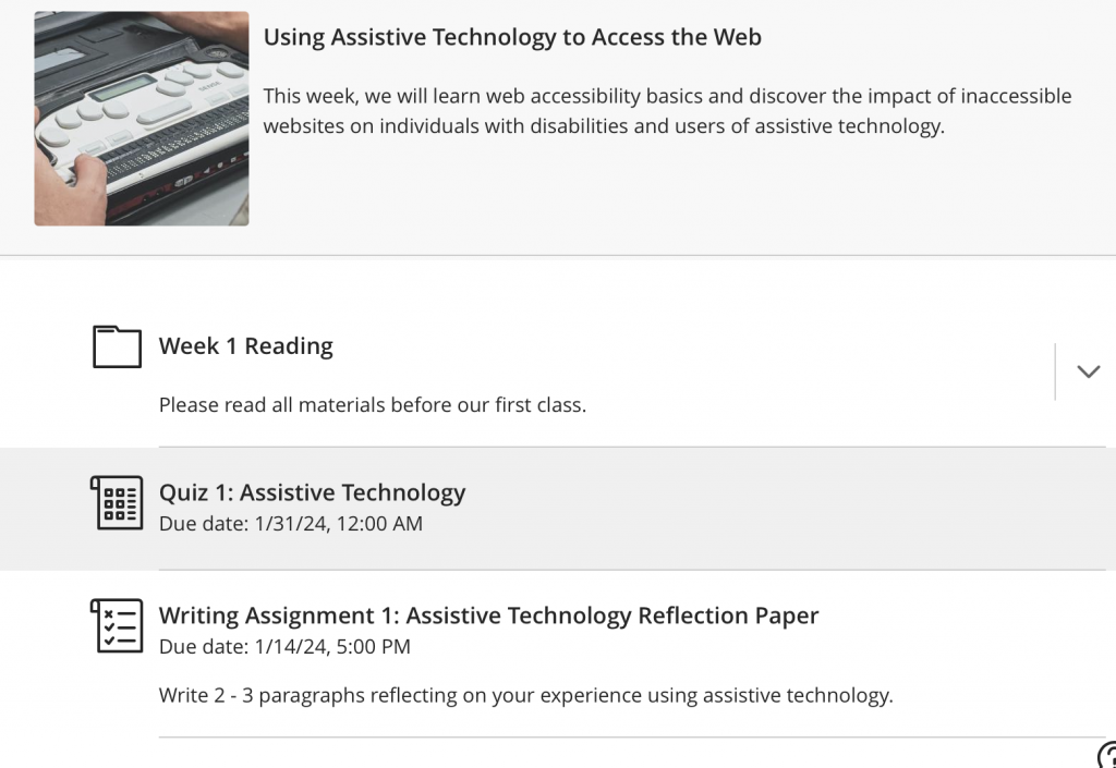
Designing and building your Blackboard Ultra course with accessibility in mind allows students of all abilities to more readily access content and participate in your course. Using a simple layout and ensuring your course content is easy to find are just a few examples of accessible design techniques. Follow these 10 steps to ensure your Blackboard Ultra course is accessible.
10 Steps to Designing an Accessible Blackboard Ultra Course
Step 1: Make content easy to find.
You can organize your content by module, topic, or content type. Whichever you choose, place content in a predictable and consistent location so students know where to find what they are looking for.

Step 2: Use meaningful name for sections, folders, links, and files.
Name your content so that students can readily determine what it is about. Avoid names like “Folder 1” or “New Document.” Also, use meaningful link text for links to third-party resources and downloadable files.
Step 3: Do not post links to documents or other essential content in Announcements.
The “Announcements” page is intended to quickly send a communication to students. It is not intended to host course content. Posting course content in Announcements may be confusing to some students. Moreover, alternative format options are not available on this page.
Step 4: Avoid uploading photocopied files.
Photocopied PDF files are not accessible to students with vision or reading impairments. They also cannot be read by assistive technology. Consider converting such files to MS Word using SensusAccess or visit Accessible Documents for other options.
Step 5: Use Blackboard Ally to check the accessibility of your content as you build your course.
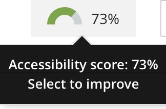
When you create a new page or upload a file, Blackboard ally automatically scans your content and provides instant accessibility feedback. Select the accessibility “gauge” to learn what issues were identified and how to fix them.

Step 6: Use headings in your html pages.
In your html documents, apply “header” in text styles to distinguish headings and subheadings from paragraph text. Users of assistive technology can more readily navigate your content and locate specific information when headings are used.
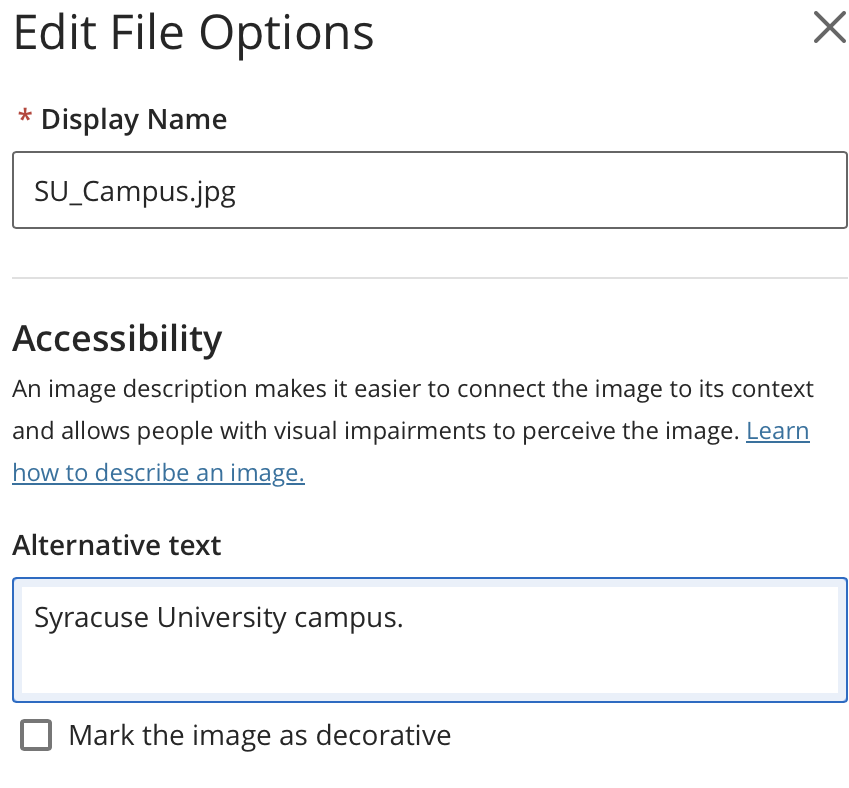
Step 7: Add alternative text to simple images and provide text alternatives for complex graphics. Mark decorative images accordingly.
Add alternative text to meaningful images. Alternative text should be concise and should achieve the same purpose as the image. For complex images and graphics, provide a text alternative on the page or in a separate file. For complex charts and graphs, provide the data in table format or in Microsoft Excel.

Step 8: Make sure all video content has accurate captions.
If you include a video in your course, ensure that accurate captions are provided. Don’t rely on automated captions because they are often incomplete, contain errors, and lack punctuation. You can manually edit automated captions using the Kaltura MediaSpace at video.syr.edu.
Step 9: Make sure the narration of videos includes all meaningful visual content or audio descriptions.
Students who are blind or have low vision miss out on essential visual content presented in videos when narration is absent or incomplete. Ideally, the natural audio of the file should include descriptive narration such that a student who is blind can access the visual content. This includes any text presented on screen. If the native narration is inadequate, consider adding audio description yourself using YouDescribe or out-source to an audio description service.
Step 10: Check your course’s Accessibility Score before making it available to students.
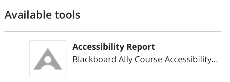
Go to “Books and Tools” and then select “Accessibility.” Here, you will find the accessibility score for your entire course and a breakdown of your content. Work to achieve an accessibility score of at least 85 before making your course available to students.

